
Dead Wax — UX, UI & Brand Identity Case Study
The stories behind the record.
Behind the Name
Where the name comes from.
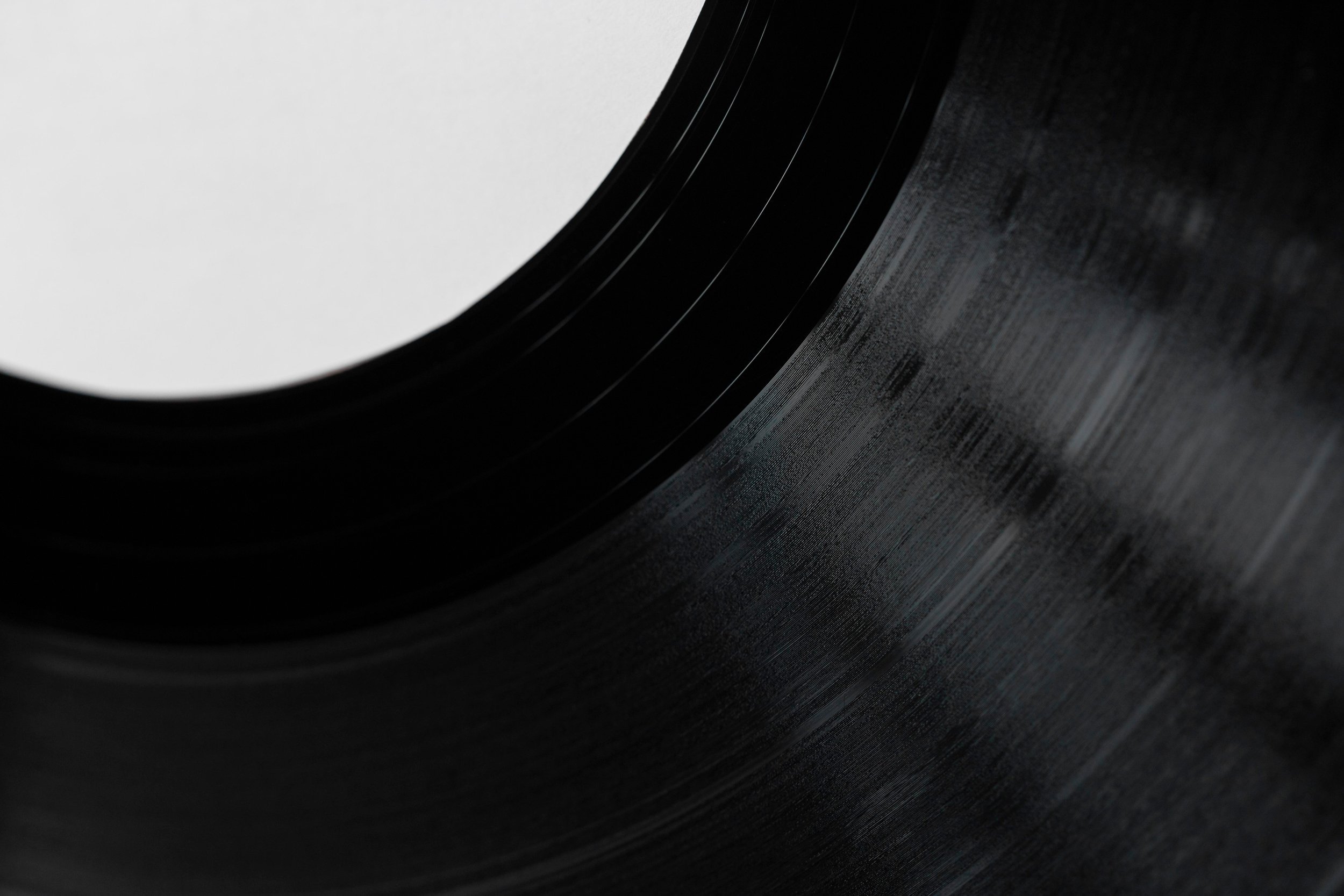
Dead Wax takes its name from the unsung stretch of a record — the smooth space between the final groove and the label. It's where pressing plants and mastering engineers leave their marks: catalog numbers, etchings, signatures, the occasional message hidden by the artist.
It's the part of the record most people never notice — and exactly the spirit of the product. A platform built to go past the cover art, to the craft and the stories pressed into every record.
Vision & Mission
Redefine what it means to shop for records online.
Dead Wax reimagines online record shopping as something personal, immersive, and effortless. Three commitments shaped every decision that followed — what the product should remove, what it should personalize, and what it should make possible.
Remove the limits of retail
- A seamless online experience that lifts the constraints of the physical shop.
- Find exactly the record you're after — without combing the bins for hours.
- Browse, buy, and sell from anywhere, on any device.
Make it personal
- Recommendations built from your collection, purchases, and listening history.
- Spotify and Apple Music integration for suggestions that actually fit.
- Friends' libraries, similar artists, labels, and what's trending.
And deepen the discovery — a community where music lovers surface new sounds, curate their collections with ease, and connect with other enthusiasts.
Research
Understand the market.
I started with the people — the needs, habits, and frustrations of vinyl buyers, from casual listeners to serious collectors, each with a different comfort level with technology. Then I turned to the category's giant. A competitor SWOT of Discogs mapped where the leader wins, and where it leaves the door open to do better.
Competitive Analysis
Discogs, by S.W.O.T.
Strengths
- Vast databaseOne of the largest catalogs of music releases anywhere.
- Engaged communityUsers contribute and edit, enriching the data.
- Market leaderA strong, trusted brand reputation.
- Built-in marketplaceBuying and selling baked into the platform.
Weaknesses
- Steep learning curveThe depth can overwhelm new users.
- Inconsistent dataCommunity entries lead to discrepancies.
- Physical-only focusDigital and streaming are neglected.
- Seller accountabilityDisputes over quality and authenticity.
Opportunities
- Streaming integrationBridge physical and digital libraries.
- Artist & label partnershipsSource and curate at the source.
- Friendlier UXA warmer interface and easier data entry.
- Data & insightsValue beyond the marketplace itself.
Threats
- Crowded fieldOther databases, marketplaces, and streaming.
- Privacy scrutinyData concerns and regulatory pressure.
- Shift to digitalStreaming may shrink physical demand.
- CounterfeitsFakes threaten trust and reputation.
Hypothesis
An immersive, personalized record-shopping experience — tuned to your Spotify and Apple Music taste — will turn browsing into buying, and buyers into a community.
Objectives
Define the experience.
Before a single screen, five questions framed who Dead Wax is for, what it helps them do, and why they'd choose it over the status quo.
Who am I designing for?
- Music enthusiasts, vinyl collectors, and record aficionados who want to explore, buy, and share records online.
- Tech-comfortable users looking for a convenient, immersive shopping experience.
What will users accomplish?
- Discover, explore, sell, and purchase a diverse range of vinyl, seamlessly.
- Lean on personalized recommendations, smart filters, and a hassle-free checkout.
Why choose Dead Wax?
- A modern, user-centric record-shopping experience.
- Convenience, personalization, and a community for curating collections and discovering new sounds.
- A way to embrace the vinyl revival and connect with the music they love.
How will they get there?
- Create an account, browse an extensive inventory with personalized filters, and check out simply.
- Spotify and Apple Music integration keeps recommendations accurate and relevant.
- Explore seller profiles, read full record details, and connect with the community.
When & where?
- Anytime, anywhere — commutes, leisure moments, and breaks.
- Across phone, tablet, and desktop, at home or on the go.
Ideation
Conceptualize the build.
With the audience and objectives set, I scoped the MVP to what mattered most — creating an account, browsing and searching records, and checking out without friction — then mapped a single user flow from first visit to completed purchase and profile management.
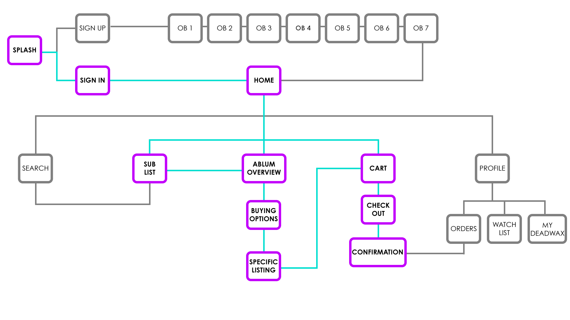
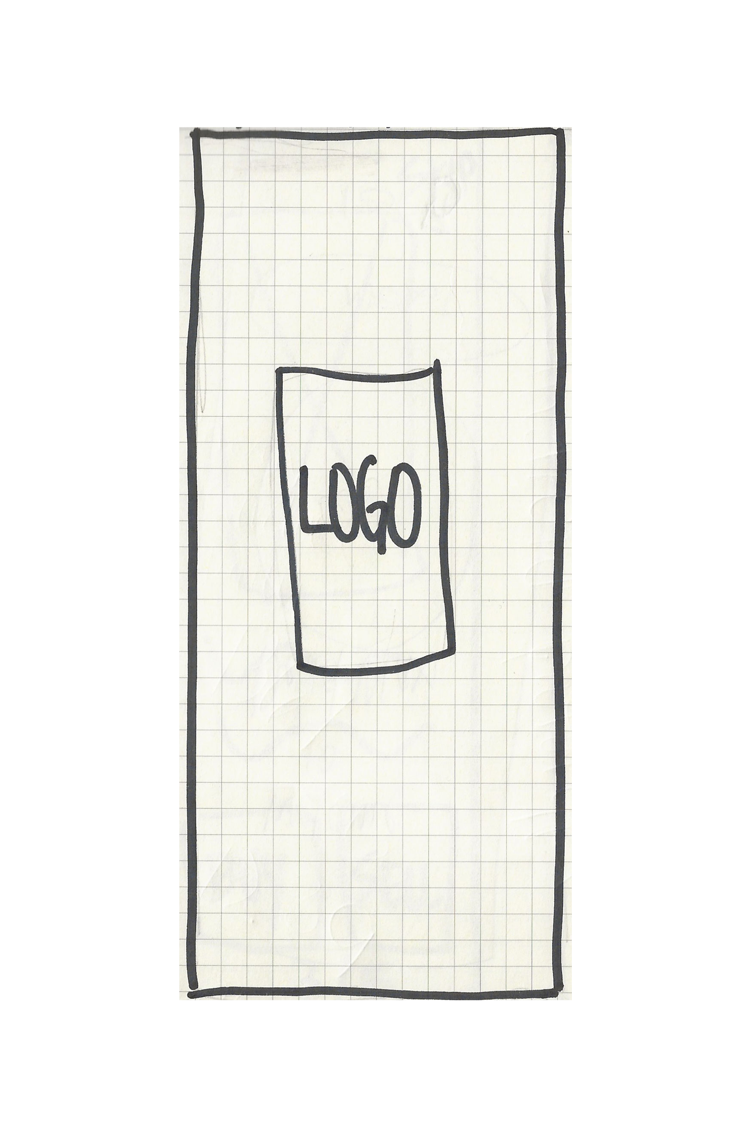
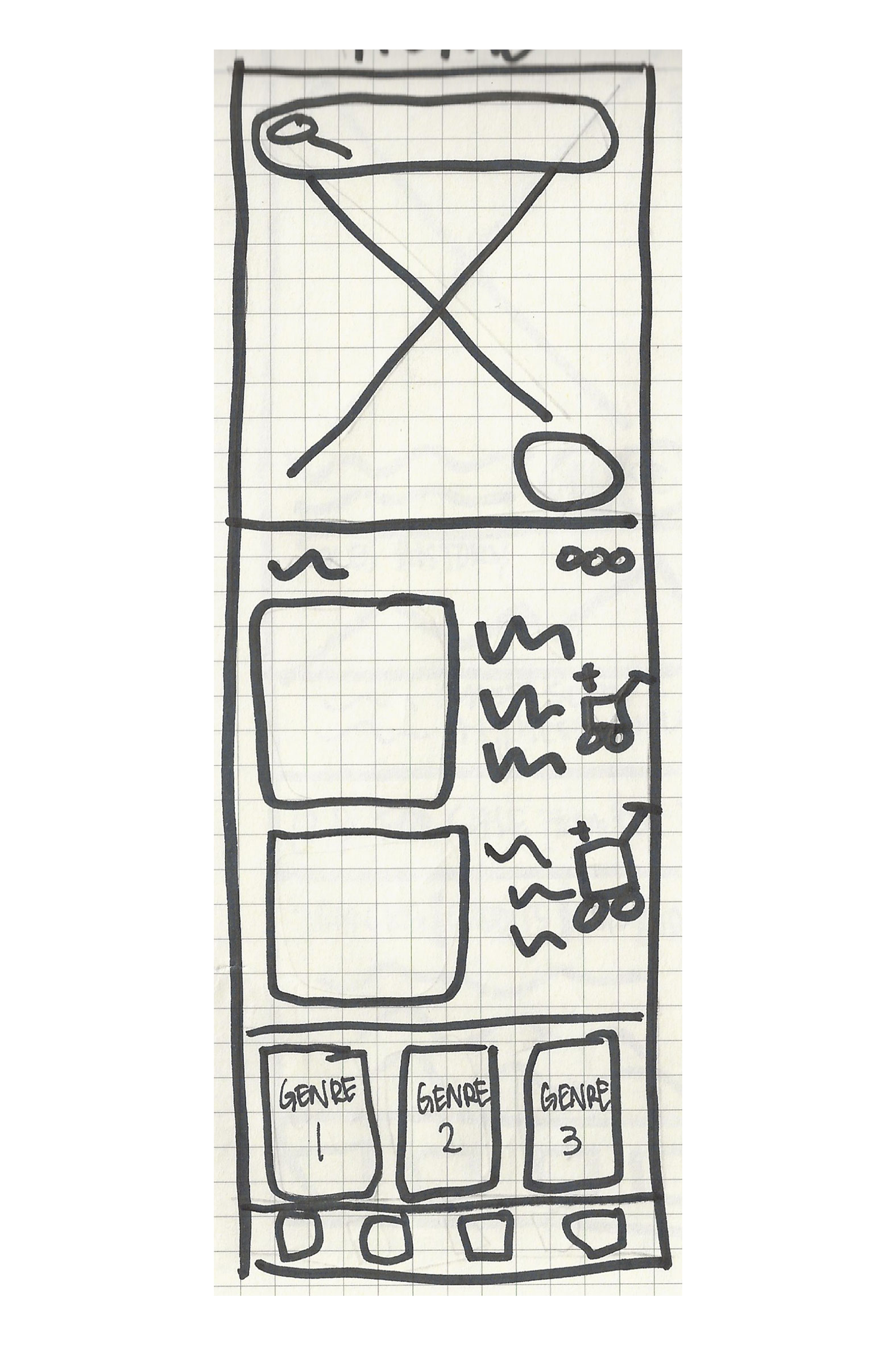
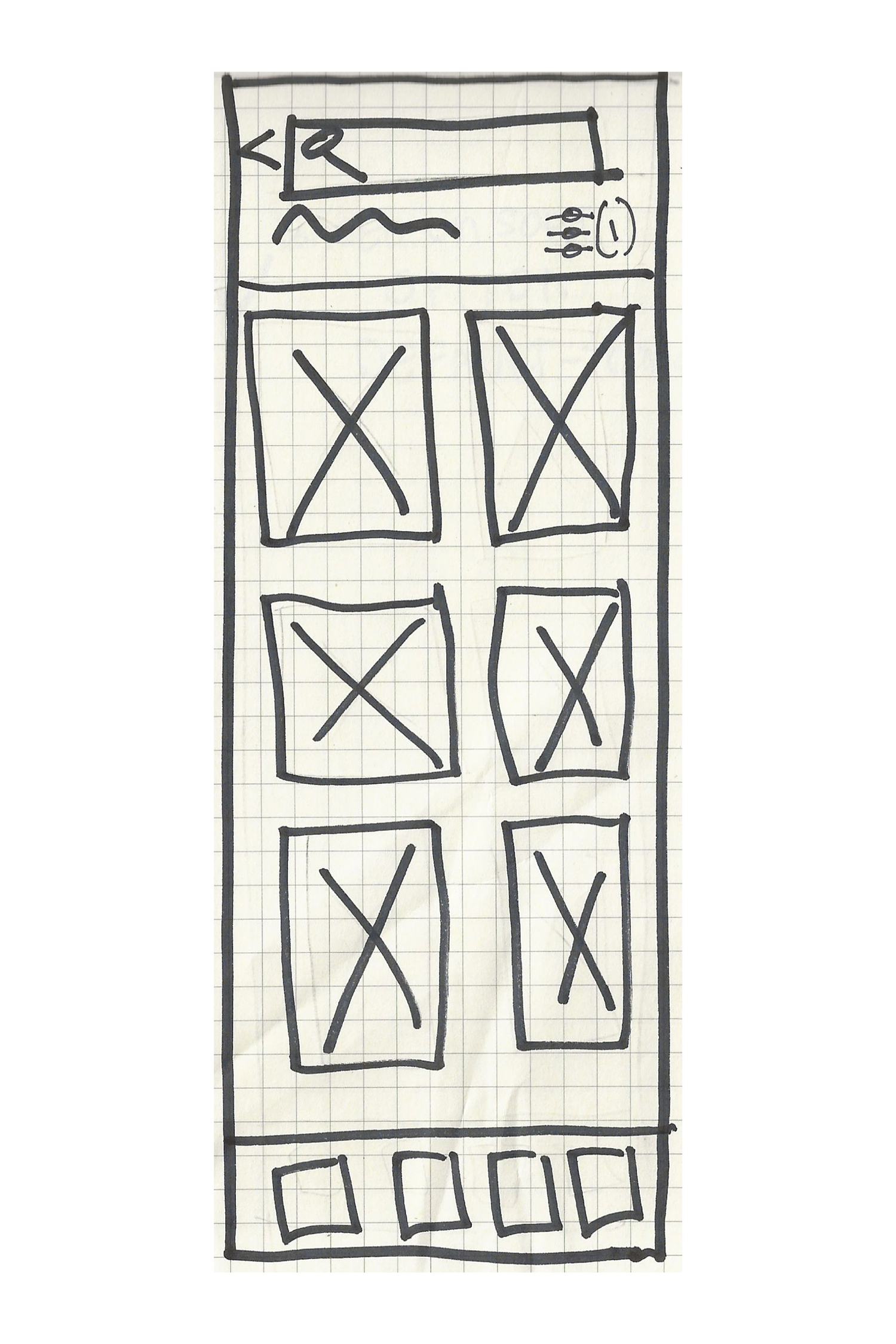
From sketch to screen. I worked up from low-fidelity sketches through mid- and high-fidelity wireframes, holding the focus on hierarchy and core flows before any color or brand entered the picture.
Low-Fidelity Sketches — Splash · Home · Browse
Prototyping & Testing
Make it tangible, then refine.
I turned the high-fidelity wireframes into an interactive prototype — browsing records, adding to cart, completing a purchase — and put it in front of a diverse group of participants. Watching where they hesitated told me exactly where the experience needed work.
“I found it difficult to spot the buying options — making these larger would make it easier to navigate.”
“Dead Wax was easy to use, but some of the type was hard to read. Sizing it up would be great.”
“I expected the home button on the left — that's what I'm used to.”
The feedback was direct, so the fixes were too: I clarified labels for key actions, raised the visibility of elements like the “For Sale” tag, made cart management more intuitive, and increased type sizes — tuning the interface to work for serious collectors and casual buyers alike.

Branding
Vintage soul, digital edge.
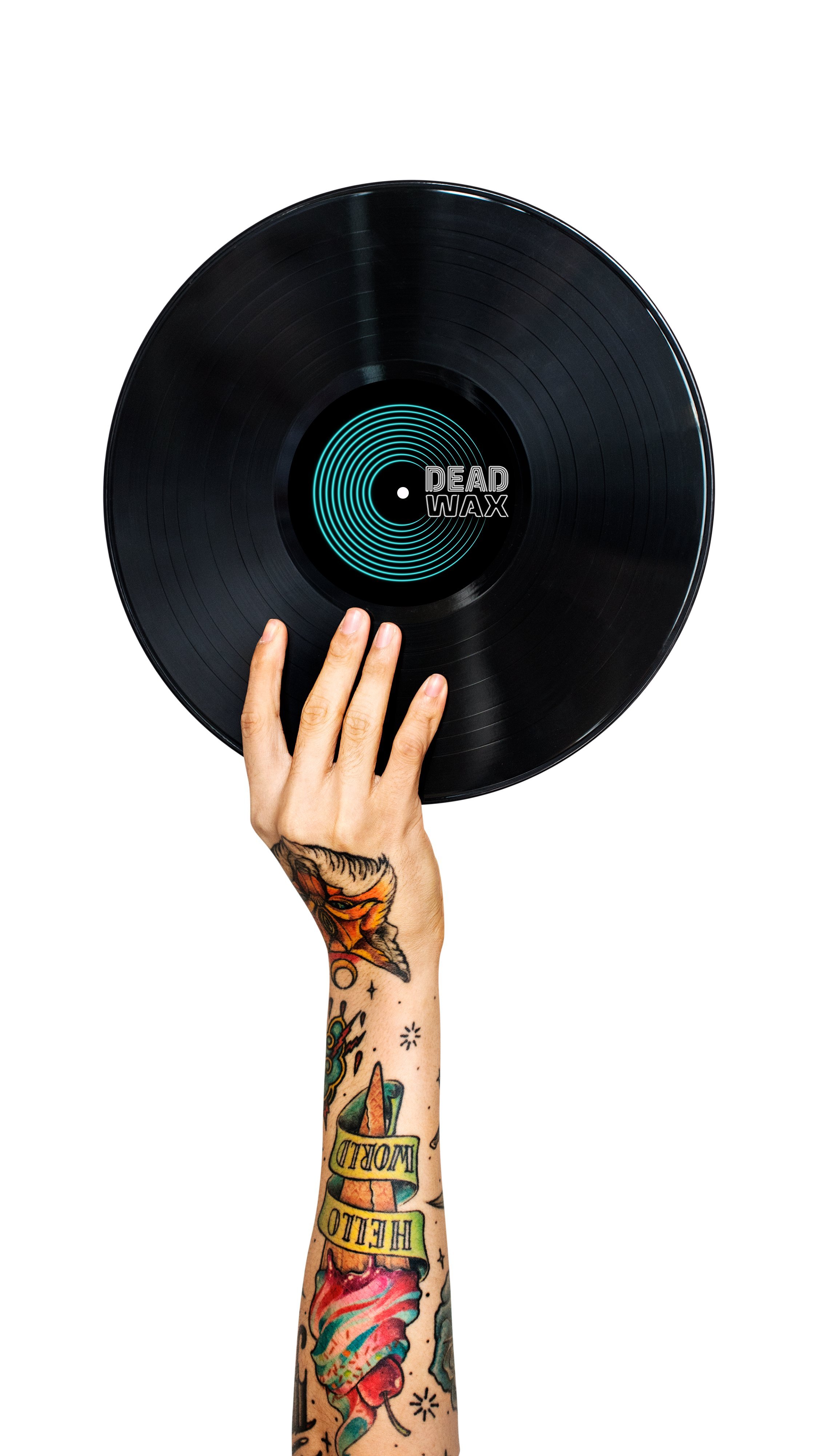
Dead Wax's identity lives where vintage record culture meets a modern interface. The mark pairs a vinyl-groove motif with confident, contemporary type, while electric neon accents carry the energy of the platform — and the thrill of the find.
Typography
Clean by default, bold on cue.
Century Gothic carries the interface — modern and highly legible at any size. Ohm Bold is held in reserve for headlines and the logo, where character matters more than quietness.
Color
A trustworthy neutral base, charged with bold, high-contrast neon — built for energy and accessibility in equal measure.
Imagery centers the records themselves — artwork and detail that let buyers connect with the music before they own it. Iconography stays unique but consistent, instantly recognizable. The voice is warm, knowledgeable, and genuinely excited about music: clear, helpful, never precious.
Own your soundtrack — embrace the freedom of music with Dead Wax.
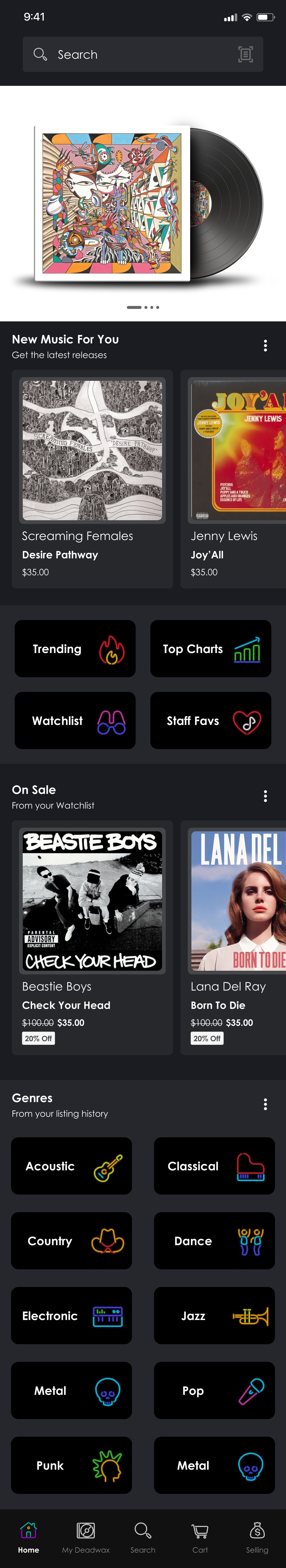
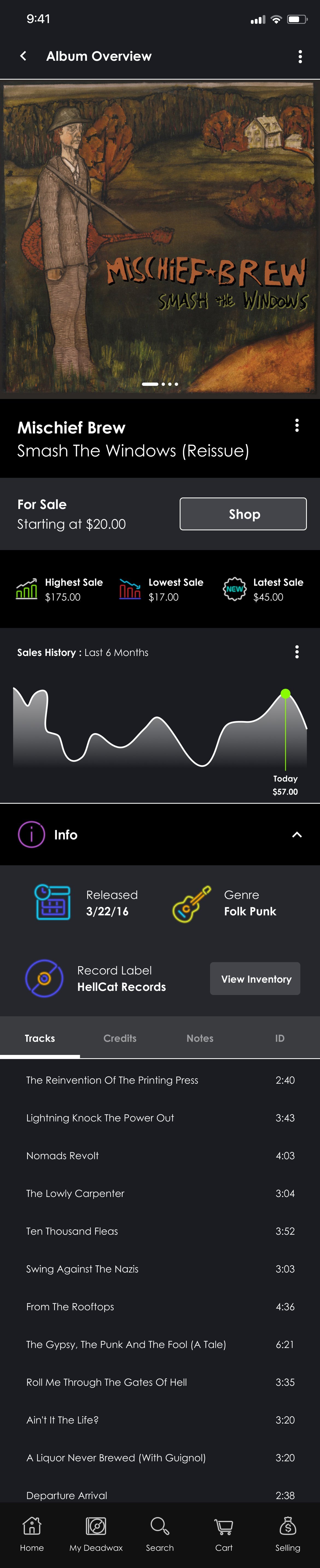
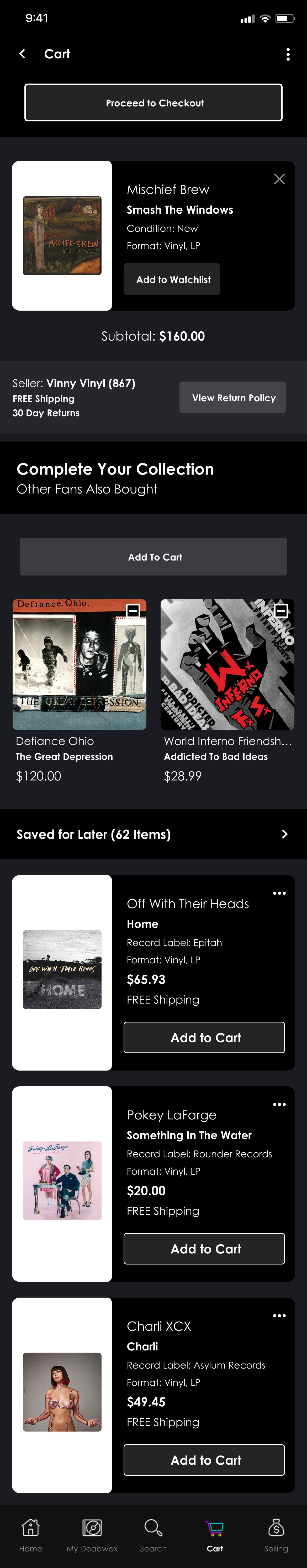
Final Designs
The product, brought to life.
With the brand in place, palette, type, and motif moved into the high-fidelity screens — a cohesive, responsive marketplace that holds together from phone to desktop.
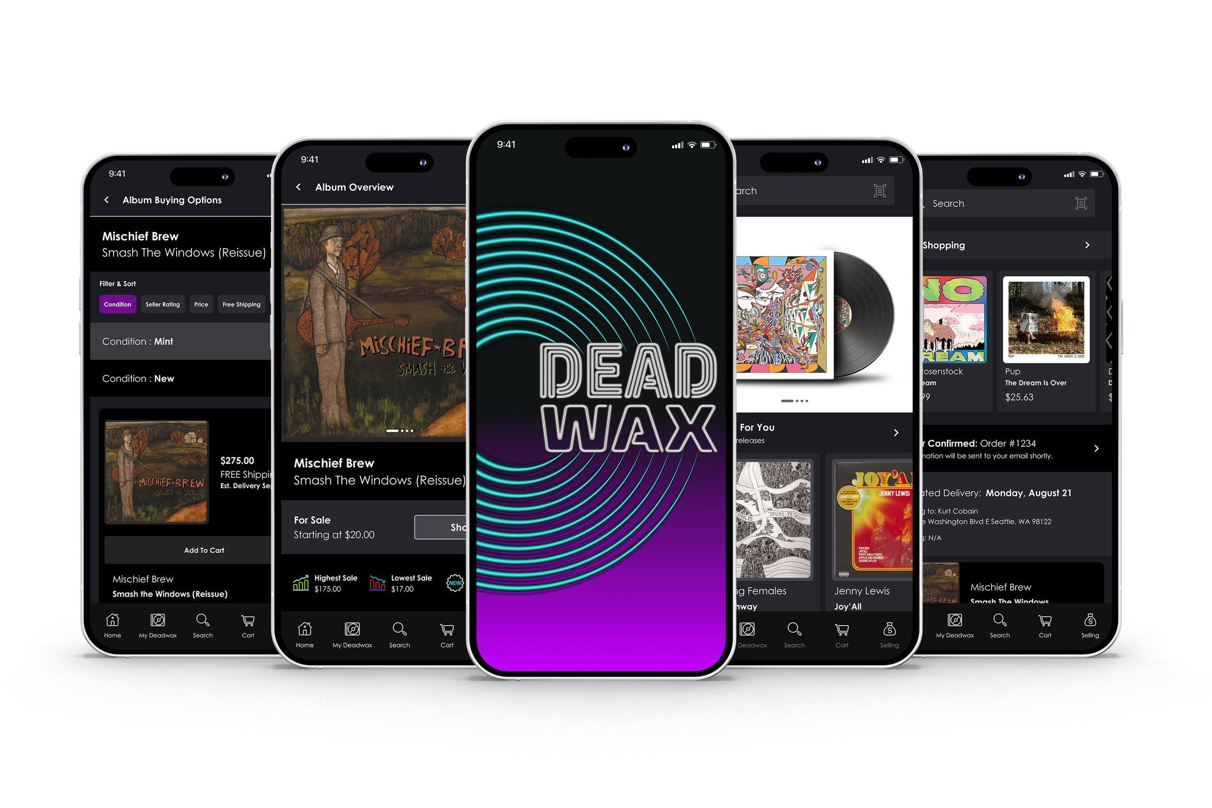
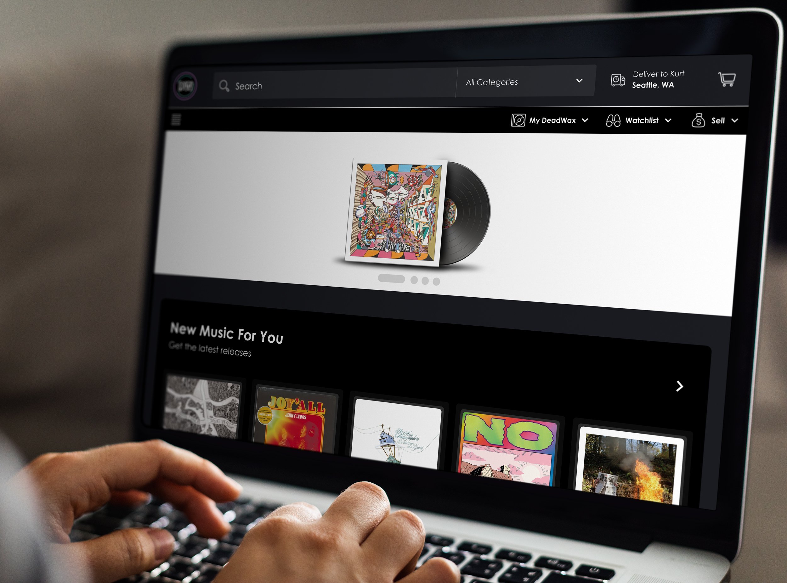
Key Screens
Until we spin again…
Building a brand and the product around it? Let's talk.