

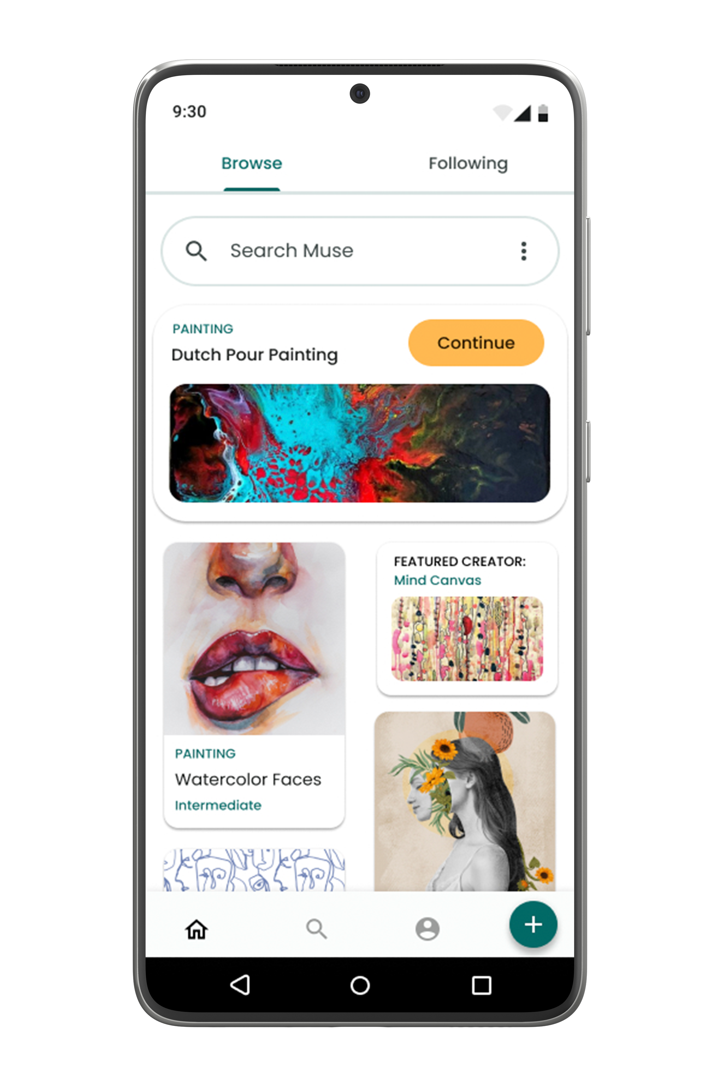
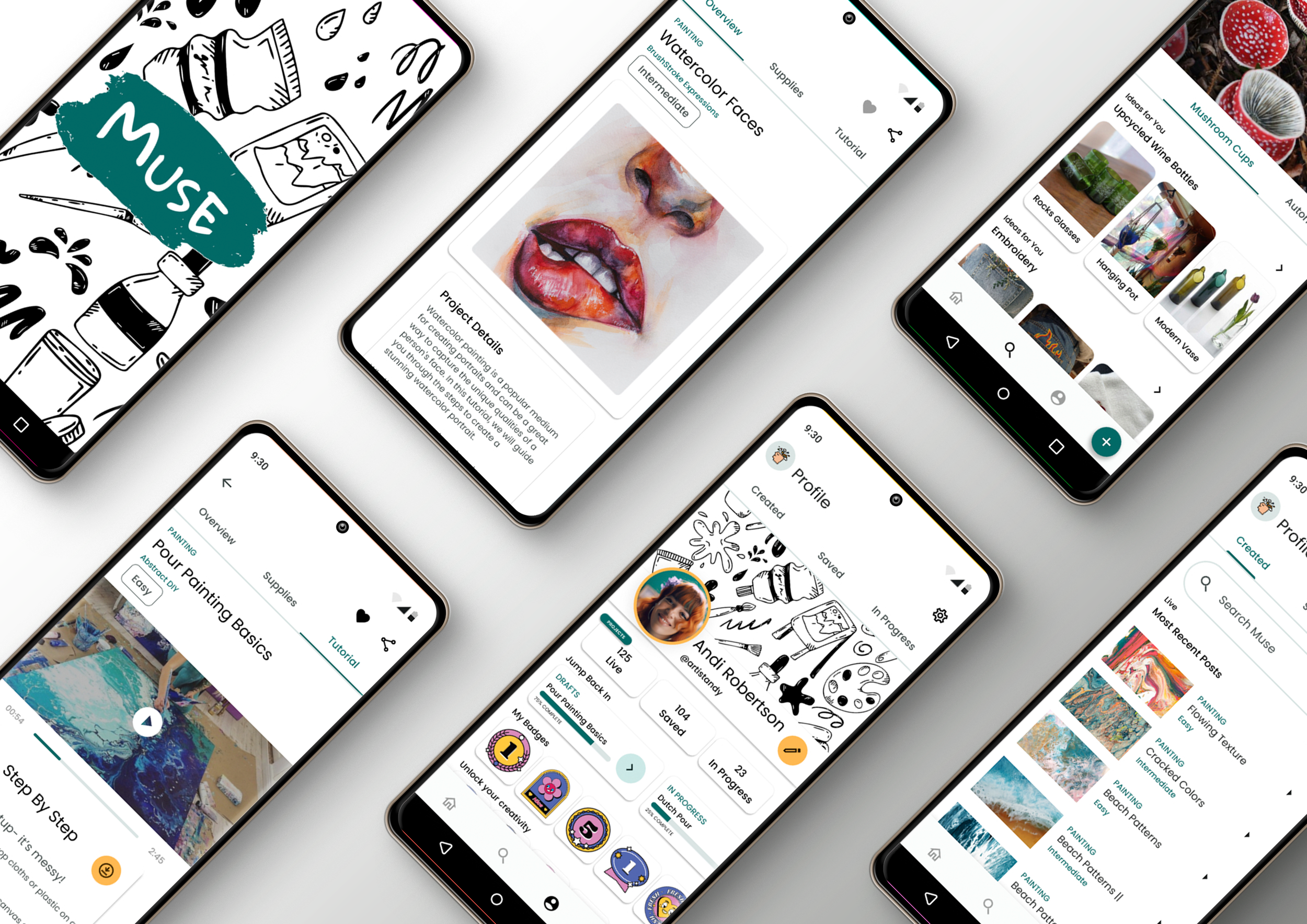
Muse
Unlock your creativity.
Overview
Muse is an art e-learning app built to spark creativity at every skill level — an interactive platform rich with resources for developing artistic ability, whether you're learning the basics or sharpening advanced technique.
The Problem
E-learning is crowded, yet no one owns crafting and art. Tutorials are low-quality or scattered across ad-cluttered sites, pushing makers off-platform and leaving them frustrated with subpar results.
The Solution
A platform built exclusively for art and crafting education — high-quality tutorials, a clean interface, and a community that inspires every skill level, so projects succeed and the experience stays a joy.
Project Approach
Research to reiterate.
Seven phases carried Muse from an empty page to a tested, polished product — each one feeding the next.
Research. Study the landscape and learn what existing e-learning apps get right — and wrong.
User Experience. Define the audience and the tasks they need to accomplish.
Ideate & Sketch. Explore concepts and layouts on paper, fast and cheap.
Wireframing. Translate ideas into low- and mid-fidelity structure.
Prototype. Build interactive high-fidelity prototypes for iOS and Android.
Test. Validate with new and returning users, scoring issues by severity.
Reiterate. Refine the design from what testing revealed.
Research
Learn from what exists.
I studied a range of e-learning and inspiration apps to shape a sharper, more focused experience. Two stood out as the closest comparisons — each strong in ways Muse could learn from, and flawed in ways it could fix.
- Very broad — lacks depth, instructions, and consistent quality.
- Friendly, scrollable feed, but mostly images and short clips with minimal context.
- Helpful search and filtering — yet tutorial results are short videos that are hard to follow.
- Intuitive, comprehensive flow for uploading a pin.
Craftsy
- More specific content, but not intuitive to use.
- Categorized, though scroll bars feel clumsy on mobile.
- Email sign-up only — no social sign-in; search returns blank, inaccurate results.
- Comprehensive tutorials, but many are paywalled, unsearchable, and closed to user uploads.
Target Audience
Who is using Muse?
Before building, I pinned down exactly who Muse serves — and what brings them back.
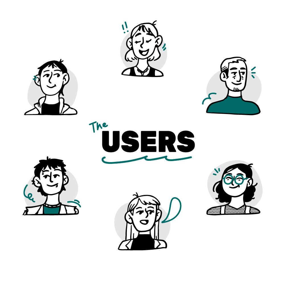
Who is using Muse?
- Anyone looking for a place to find and share crafting inspiration and tutorials.
What will they accomplish?
- Contribute — share their own projects and tutorials.
- Search projects — save, share, and follow along with tutorials.
When & where?
- Hunting for crafting ideas, or following a tutorial step by step.
- Sharing a finished project or a how-to.
- Anywhere — on the road or at home in the craft room.
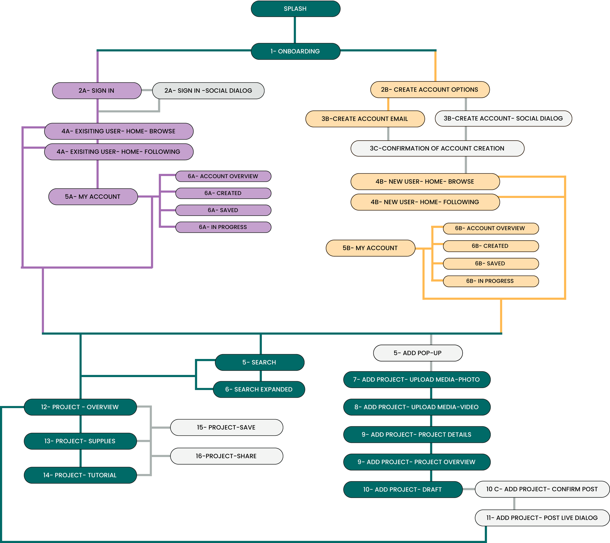
User Flow
Map the experience.
With the audience defined, I mapped a user flow tuned to how makers actually move — search, learn, create, share. It became the backbone for every screen that followed.
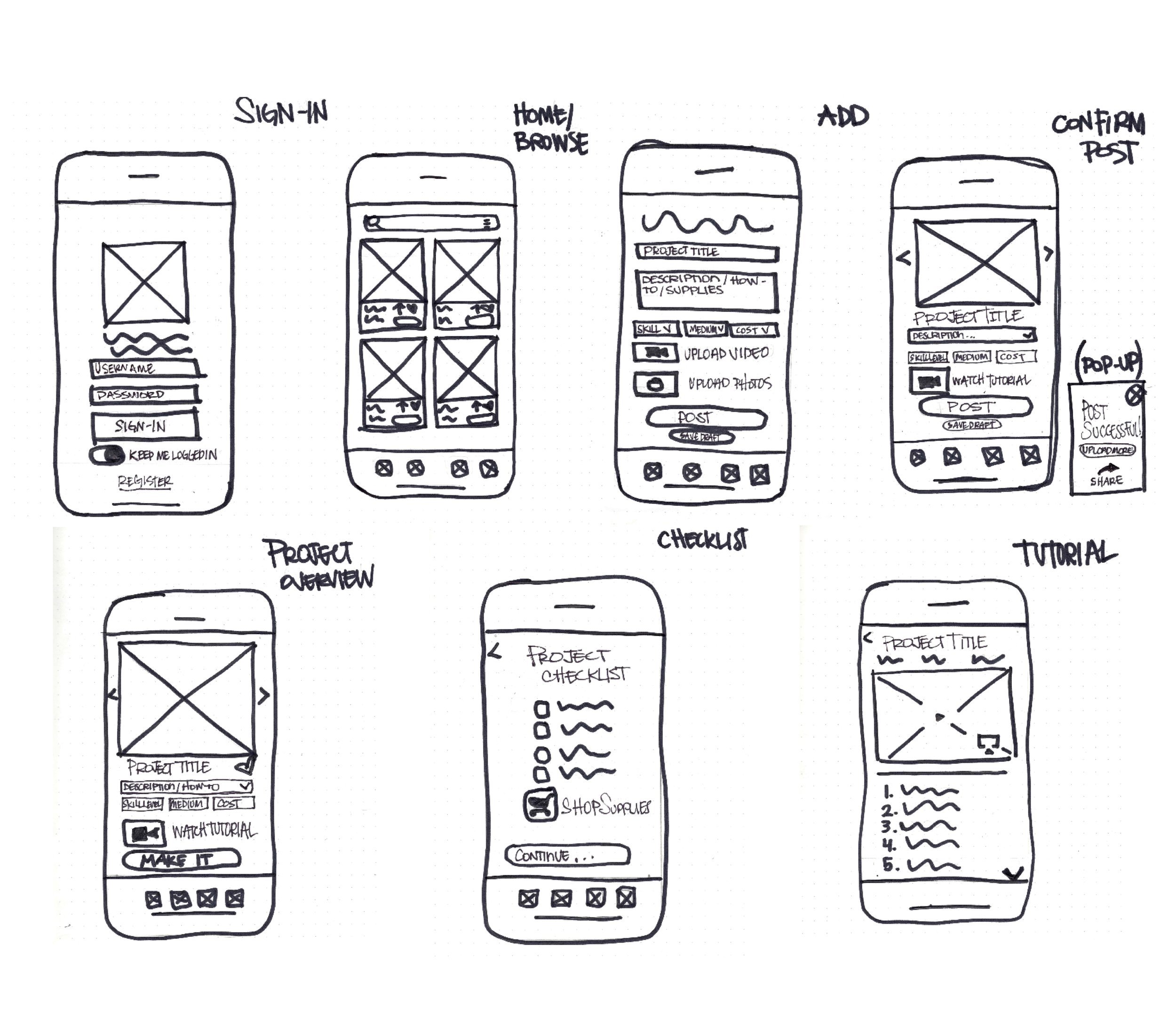
Wireframes
Low to high fidelity.
I sketched low-fidelity wireframes to test layout and interaction fast, then refined them into mid-fidelity — adding just enough detail to balance simplicity with function.
Style Guide
Establish the aesthetic.
I set a visual language that feels handmade but never messy — Poppins for clarity, Gloria Hallelujah for personality, grounded in a confident palette of teal and amber.
Poppins
Interface & body
Gloria Hallelujah
Accents & personality
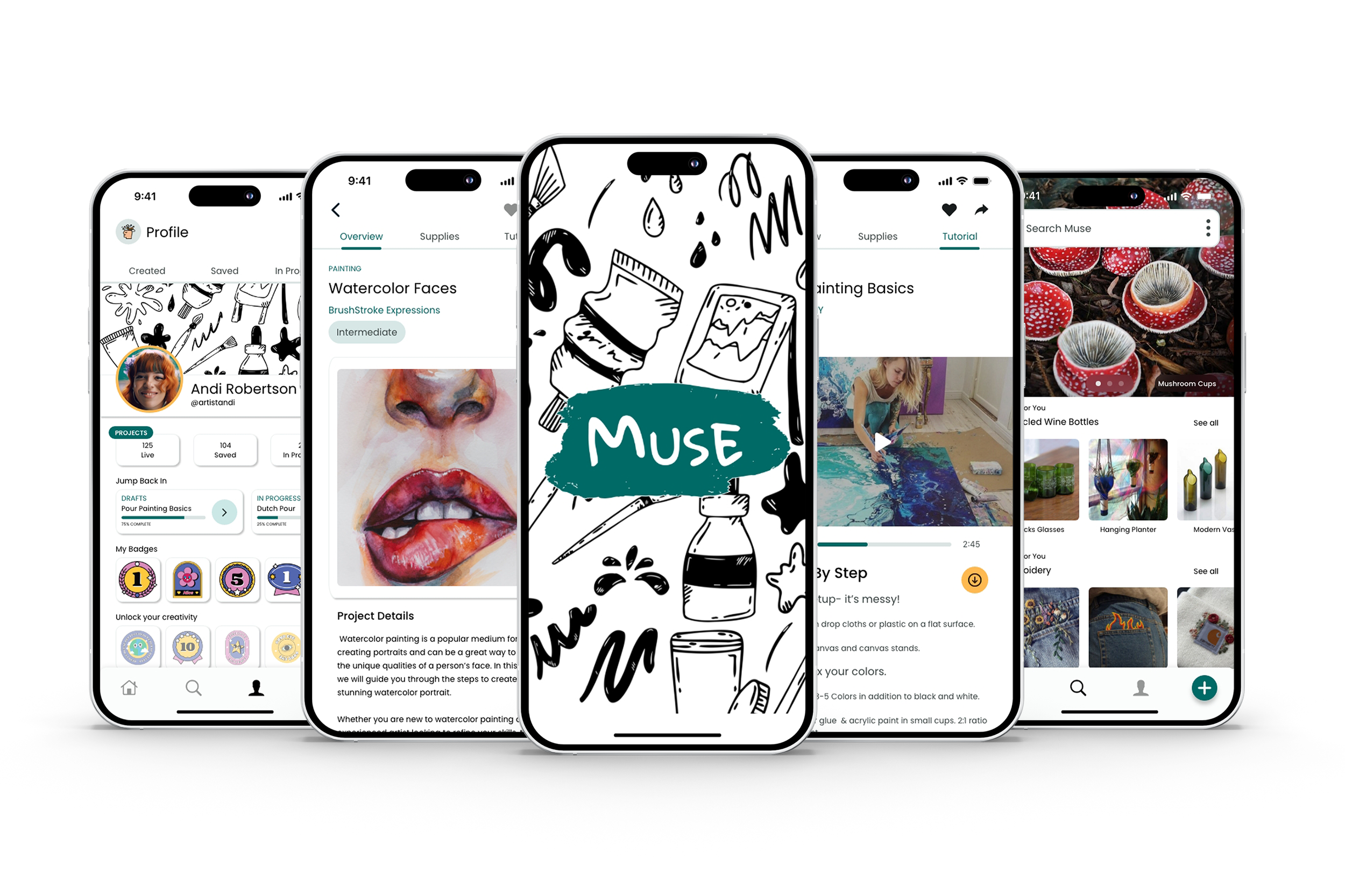
Prototyping
Bring Muse to life.
With the style guide in hand, I built high-fidelity prototypes for both iOS and Android — a vibrant, intuitive experience tailored to makers, native to each platform.
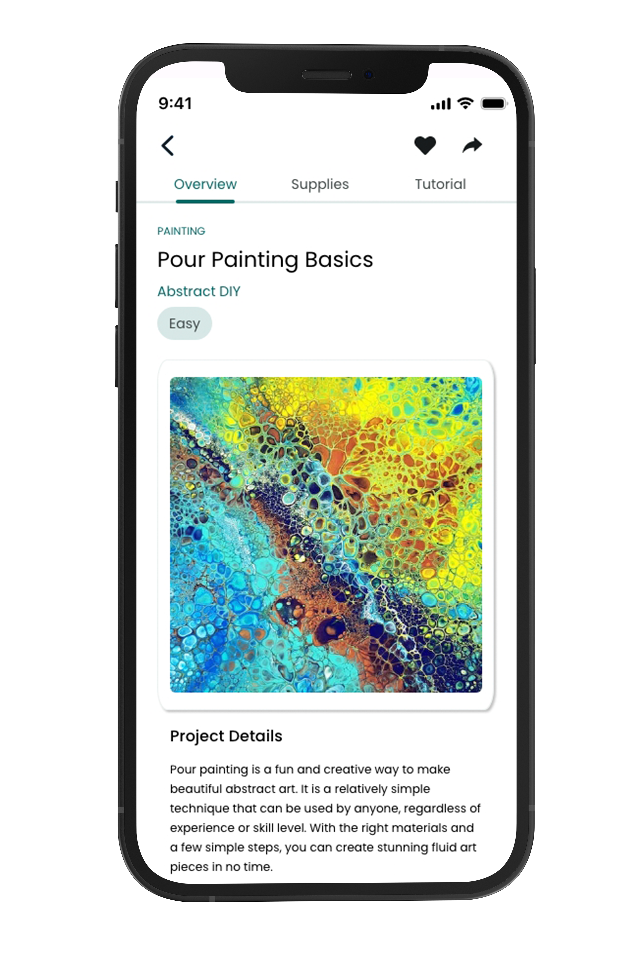
iOS & Android
User Testing
Test by severity.
I watched new and returning users move through the core tasks — create an account, sign in, browse, add a project, save, share — and scored every issue on a standard severity scale, from cosmetic to catastrophe. The verdict: most found Muse intuitive on first use, and the friction that remained was clear and fixable.
Revisions
Turn feedback into action.
I made the changes that mattered most: restored back buttons where navigation dead-ended, sized up card text for readability, and restructured the profile so the whole experience felt simpler.
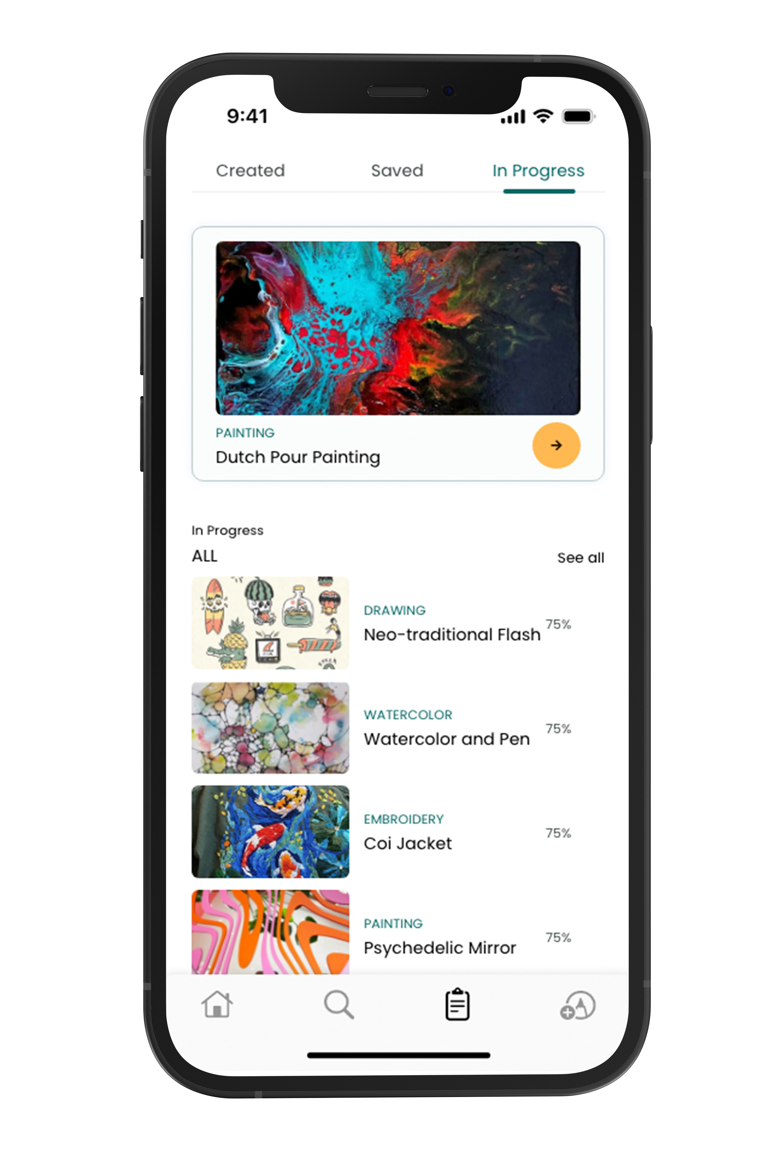
Restructured profile — Created & In Progress
Final Product
An intuitive art platform.
Through careful flow, honest testing, and steady iteration — low-fi to high-fi — Muse became a vibrant, comprehensive e-learning platform that helps makers unlock their creativity, on iOS and Android.
Have a creative product to build?
Looking for a designer, or building something for makers? Let's talk.